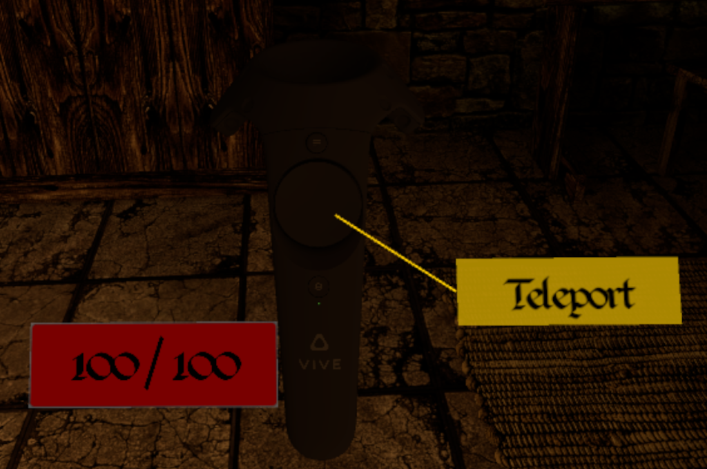
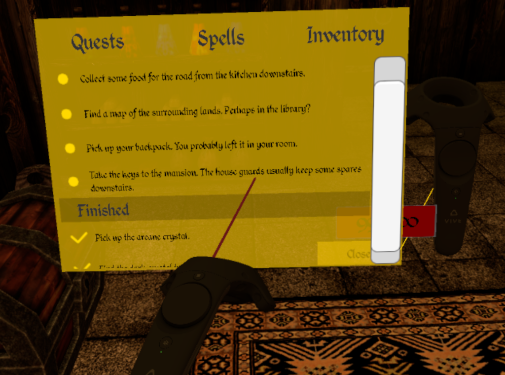
VR is a new medium, one for which we haven’t exactly figured out yet what the best way to do things is. An interesting example is building GUI’s (Graphical User Interfaces). In almost any computer program, you will have a central area on screen where actual stuff happens, and a lot of menu’s, options, sidebars, etc littered around the edges of the screen. This is convenient, because they don’t demand a lot of attention if you don’t need them, and it’s easy to focus on them if you do.
In computer games, the HUD (Head-up Display) is the standard way to present information to the player, check out for instance this screenshot of Counter Strike Global Offensive:
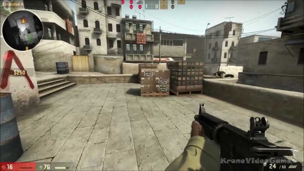
There is a bunch of information on the edges of the screen; a minimap, health, ammo, team status.
In VR, this method of presenting information to the user does not work. When users move their head, the screen they look at moves with it, because it is mounted on their heads. This means the only way to focus on pieces of UI on the edges of the screen is keep your head still and only move your eyes. Try holding your head still, hold up some writing in your peripheral vision, and then read it. If you can do it at all, it will not be comfortable. Now imagine that wherever you move your head, this piece of writing will stay in the exact same spot in your peripheral vision. This will drive you nuts in the long run.
They way to go then in Virtual Reality, is to somehow integrate the UI in the world that people are immersed in. A poster on the wall could provide information. It would not move, and the user could focus on it by moving up to it and reading it. However, if the user moves away from the poster, the information is no longer accessible, and so this method only lends itself to presenting information that is highly situational.
Another option is to tie the UI to the controllers the user is holding. That way, the user can always access the information when he wants to, although it may inhibit the user in performing whatever he is executing. Consider cooking a meal from a recipe on an iPad; you access the recipe wherever you want to, but to do so, you will have to stop the actual cooking for a moment. Interesting examples of this method are QuiVR, where the current score screen is on the back of your hand, and turning your hand so you face your back magnifies this score screen, and The Brookhaven Experiment, where your current ammo is projected on the side of your gun.
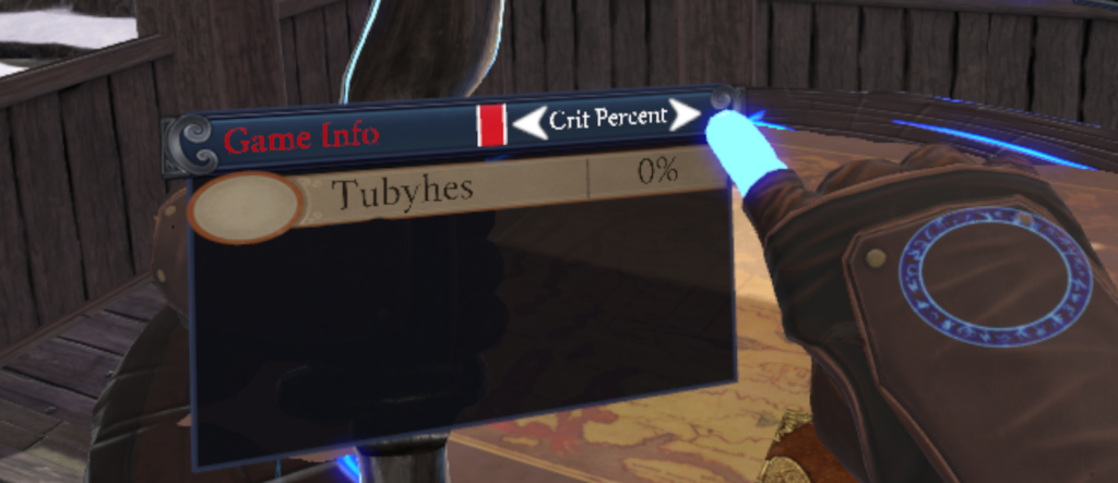
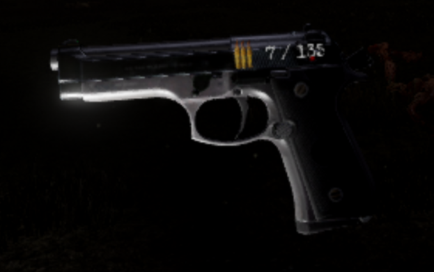
While these are interesting options to present UI, one might also ask the question: should we aim to have as much UI as do in traditional games? VR is supposed to be more realistic than traditional flat-screen gaming, and a lot of the information that is presented to the user in traditional games is simply not there in real life. There are no minimaps, health bars, ammo indicators, quest logs, inventories, etc.
With any new technology, concepts of existing technologies will be applied in the beginning, until some pioneers find really new and innovative ways to exploit the capabilities of the new piece of technology. Think about the first websites, that were basically electronic leaflets or smartphones that started out primarily as devices for placing phone calls and sending text messages. It will be interesting to see how UI’s will develop in Virtual Reality, and if maybe a couple of years from now there will be a standard way of doing things that today nobody thought of yet.
Me, I’m sticking to a health bar and quest log that are attached to your controller for now.
